Ida Davidsen / Rebranding
The current visual identity is unclear, outdated, and does not communicate the values of the company. With this project we wanted to investigate how much you can play with an iconic brand like Ida Davidsen. Furthermore we will see how far it is necessary to move from the visual cliches to appear attractive to the younger generation while retaining the authentic history in a contemporary and modern way.
Ida Davidsen anno 2017 is a modern and authentic restaurant that shows that they renew themselves. The new visual identity helps signal a new beginning.

For headlines, we have chosen to use the Art Deco inspired display font Goldana. Here we have chosen to mix the ‘Base’ and ‘Script’ sections to create a characteristic and exciting image and each of them signals something different. The Base section is more rough and edgy and can in many ways resemble a display font taken directly from a facade.


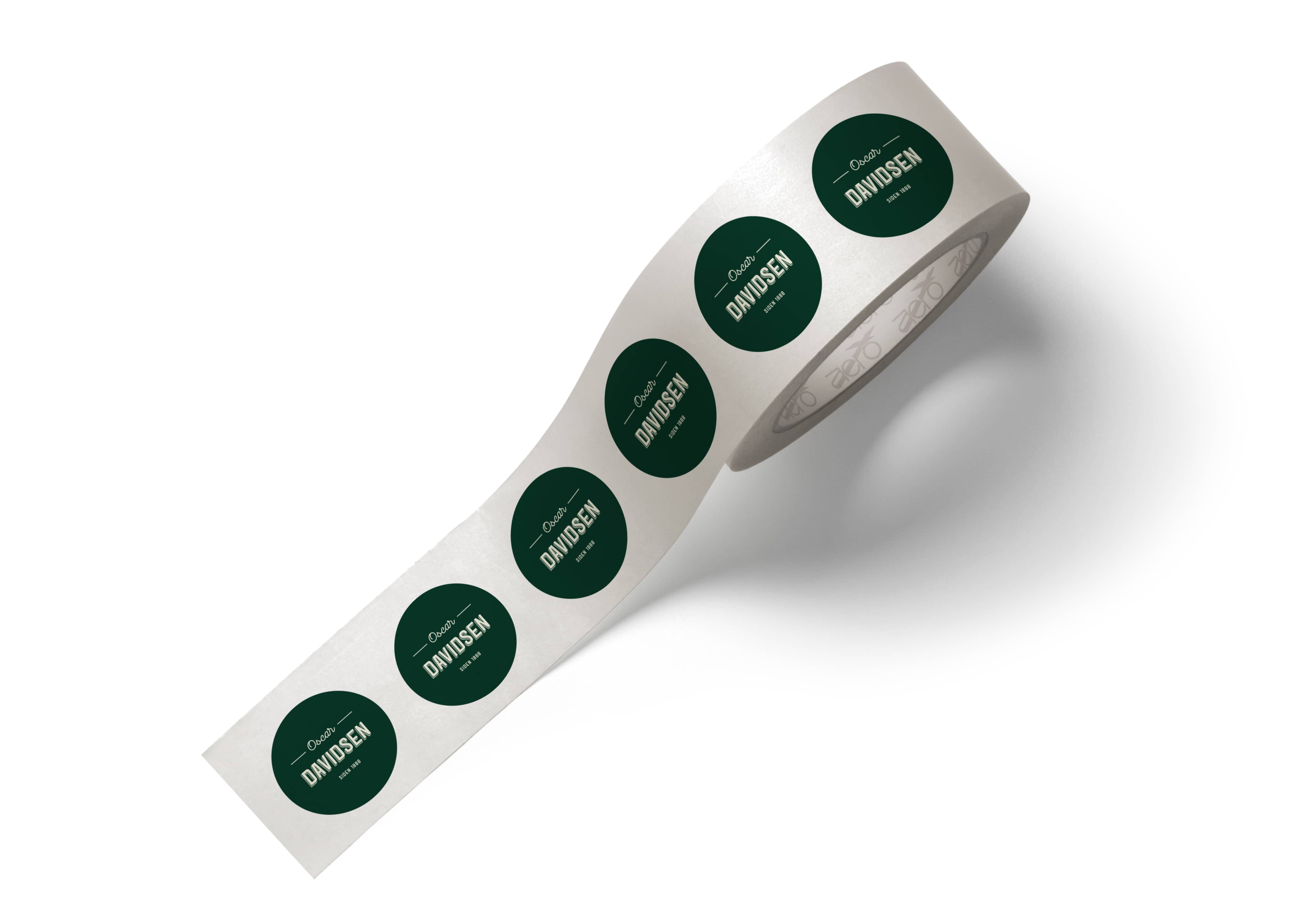
We have chosen a simple color palette consisting of three colors, which may vary in terms of transparency. We have chosen the dark green color that signals quality and loyalty and is most often seen in connection with restaurants. In addition, we have chosen a brown color that is often associated with something old and historical and at the same time a warm color. Finally, we have chosen a warm white color that contrasts well with the other two colors and signals purity and credibility.

The icons are a stylized version of open-faced sandwiches. This gives a high information value. It is therefore clear to see what kind of restaurant thats behind the identity. The icons help create a characteristic and personal expression that makes the identity appear original compared to the other open-faced sandwiches restaurants. The grunge effect on the icons helps gives an expression of something old and raw.
![]()


With the menu, we want to create the feeling of getting close to the kitchen making the guest feel as part of an ‘authentic’ experience. A special experience that guests should remember when they leave. The menu cards must hang on hooks, which gives the feeling of sitting in the middle of the kitchen.

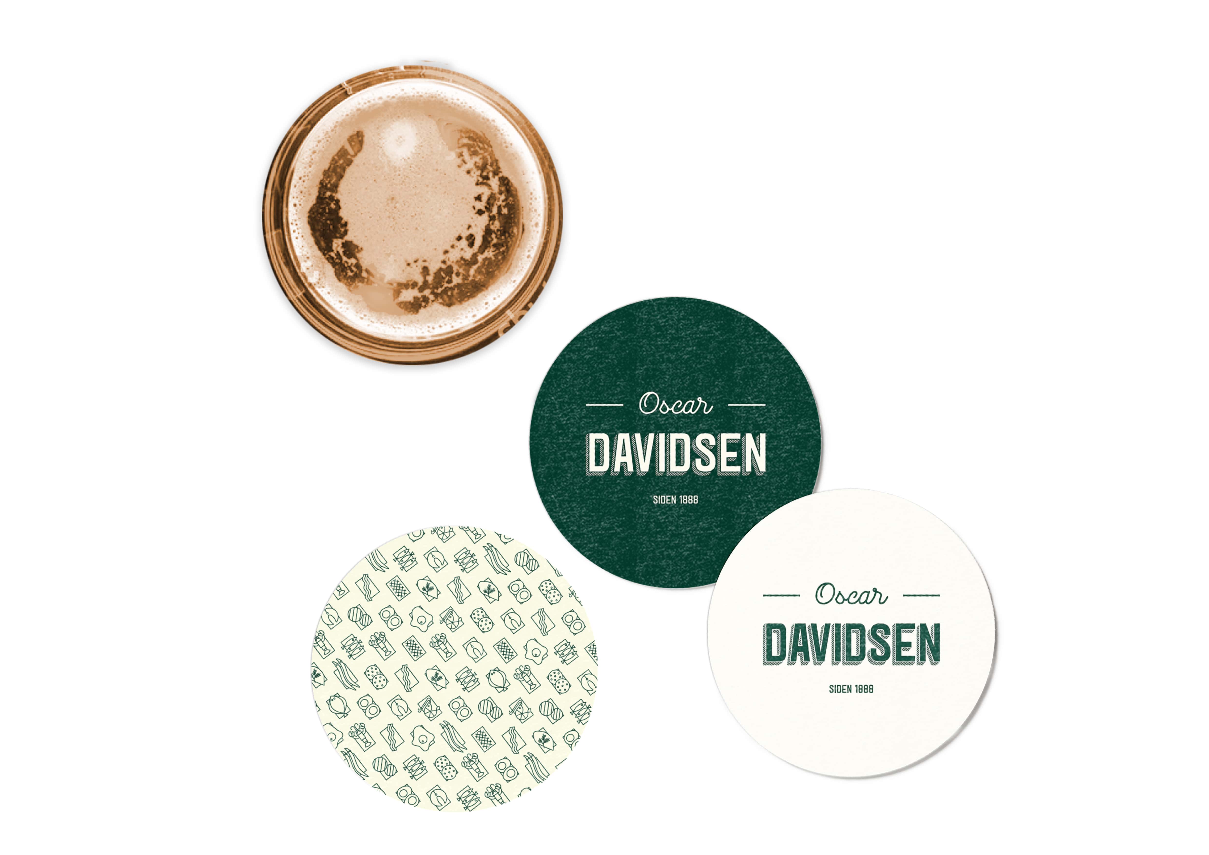
We have chosen to make beer coasters to create a cozy and relaxed atmosphere that oozes Danish draft beer and traditional open-faced sandwiches.

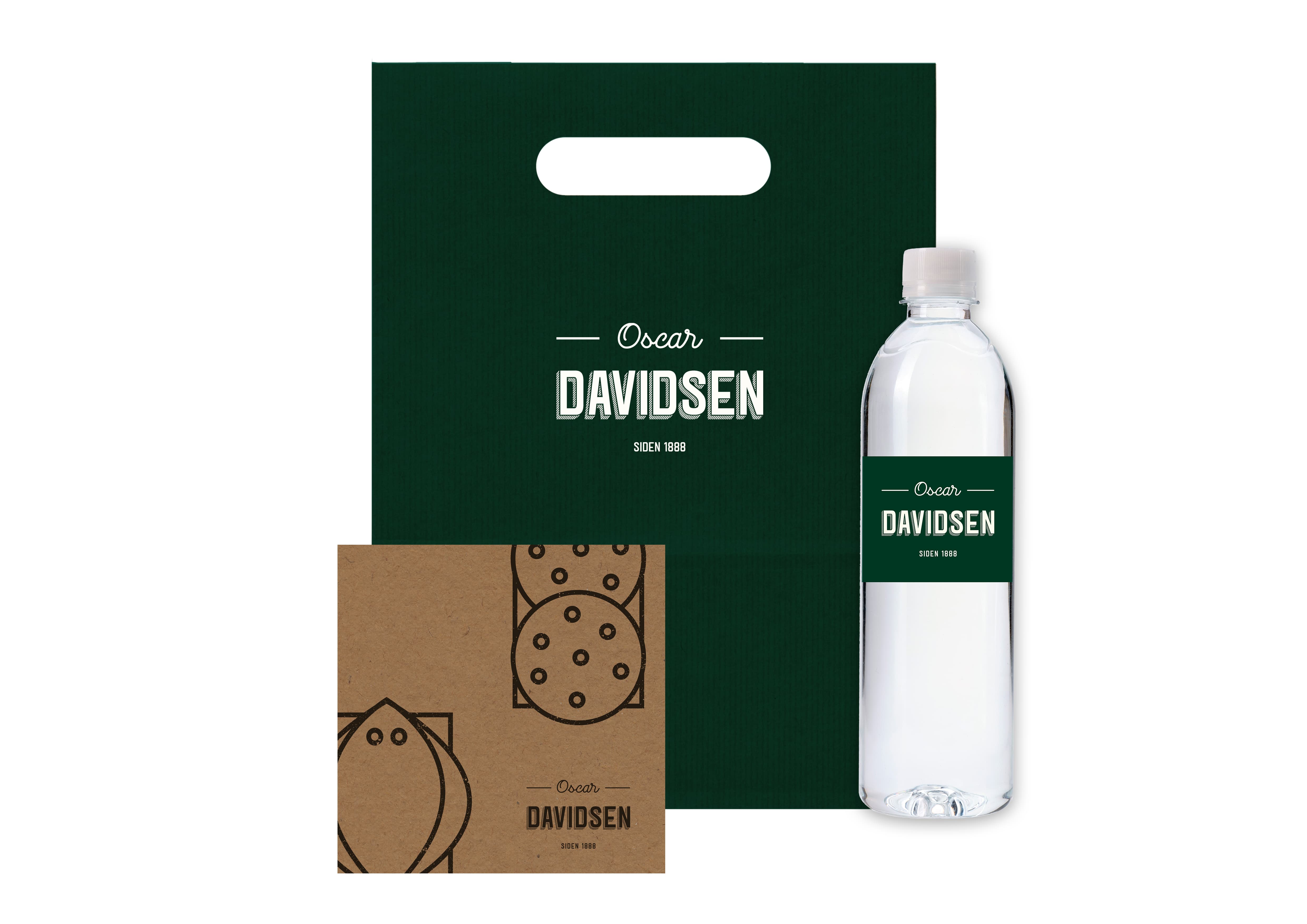
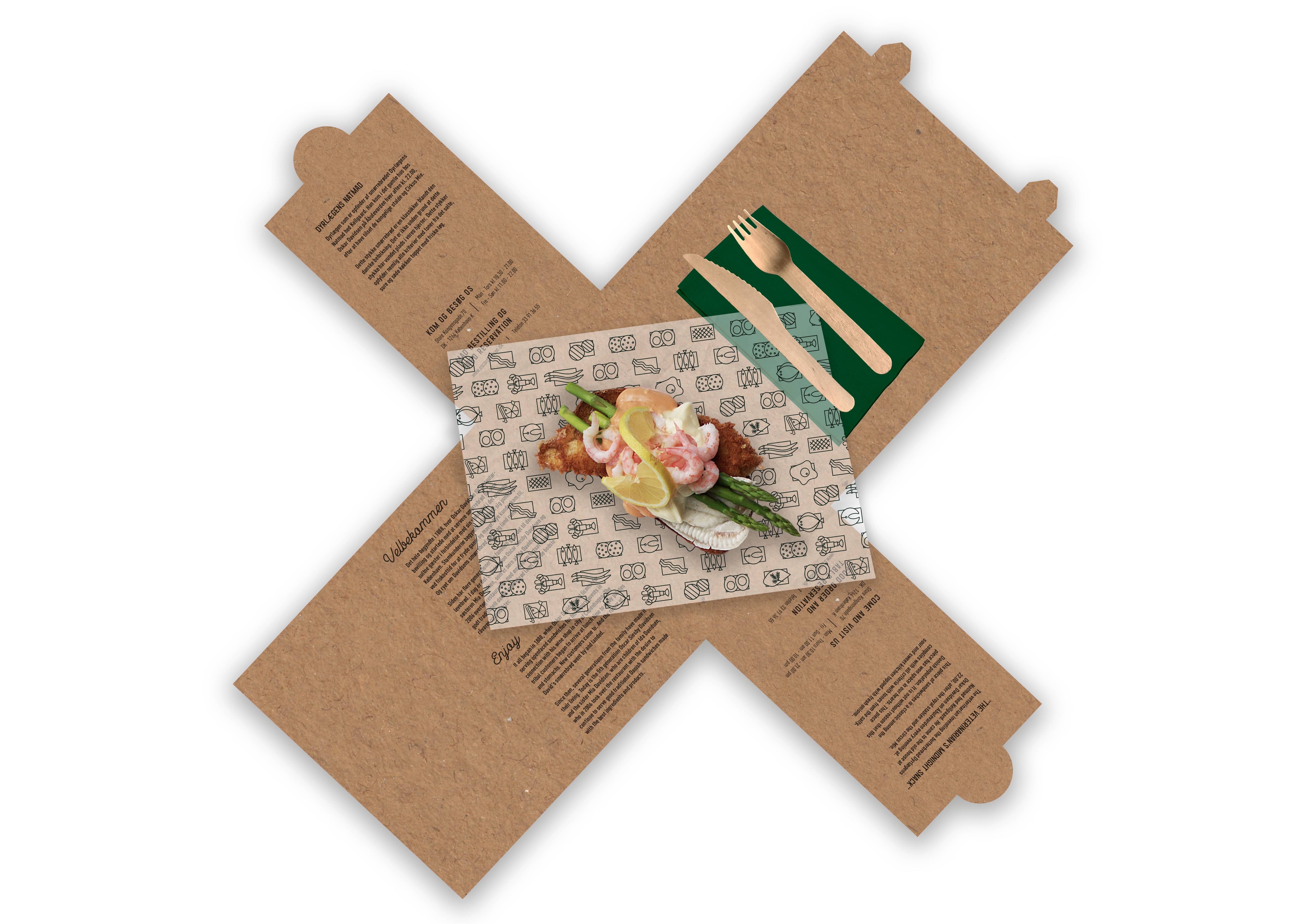
This small take-away box is for the purchase of a single piece. It’s handy to take with you and at the same time creates awareness with the graphic icons. The box is only composed of a piece of cardboard, which makes it appear more exclusive. Inside the box is the cutlery. This means that everything is gathered in the same place and you do not risk losing it on the road. The four flaps close the box securely and gives a good size ‘plate’ to eat your food, for example, if you have to eat your food in the park or at the edge of the harbor. On the inside there is also added a small text about the restaurant both in Danish and English to the delight of the foreign tourists.